The Top10 Trends That Will Determine Visual Culture in 2026.
The design world in 2026 is living a fascinating contradiction: the more AI dominates creative tools, the more clients are craving human imperfection. At Design Orbits, we work with startups and global brands every day — and we’re seeing this shift play out in every brief that lands in our inbox.
Whether you’re a business owner looking to refresh your brand, a marketer briefing an agency, or a designer staying sharp — this guide breaks down the 10 graphic design trends defining Graphic Design Trends 2026, what they look like in practice, and how to actually use them.
The Reason Why 2026 Is a Critical Year for Design
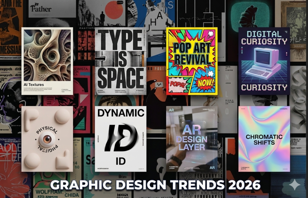
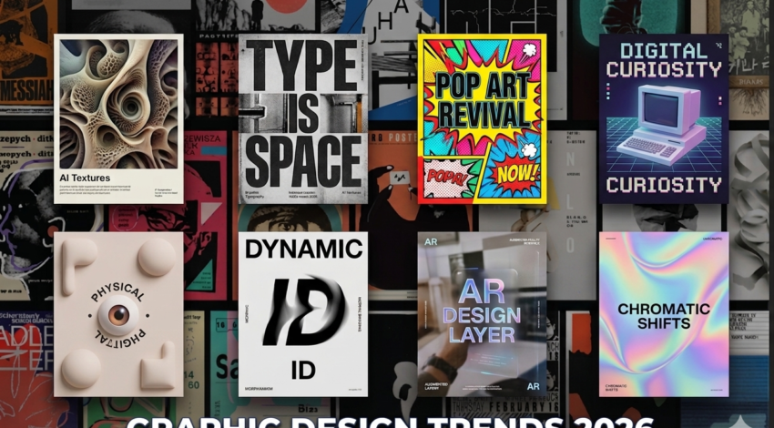
Graphic Design Trends 2026
This is the year of collision between two forces. AI is now integrated into nearly all workflows of creativity – concept generation, layout automation. On the other, audiences are increasingly fatigued by the polished, synthetic look that AI tends to produce.
The result? Design that feels made by human hands is having a massive comeback. Adobe’s 2026 Creative Trends Forecast notes a 30% rise in searches for hand-drawn and imperfect design elements. Brands that leaned into clinical perfection are now scrambling to add warmth, texture, and personality back into their identities.
| Design Orbits Insight We’re seeing this in client briefs weekly. Founders and CMOs are now specifically asking for designs that ‘don’t look AI-generated.’ Authenticity has become a commercial brief requirement — not just an aesthetic preference. |
Top 10 Graphic Design Trends for 2026
As we explore the various styles and techniques, it’s essential to keep in mind the overarching theme of Graphic Design Trends 2026.
1. Anti-AI Crafting — The Human made Comeback
It is a defining trend of 2026. Designers worldwide are deliberately introducing imperfection back into their work , hand-built typography, scanned textures, rough collage edges, ink-pressed finishes, and analogue surfaces that no AI can realistically replicate.
Imagine it as the remedy to algorithmic uniformity. Brands that want to stand out in an AI-saturated landscape are commissioning work that looks unmistakably made by a human.
- Hand-drawn logos and icon sets
- Scanned paper textures used in brand identities
- Deliberately rough, imperfect typography
- Collage-style compositions mixing physical and digital media
Who it’s for: Lifestyle brands, creative agencies, independent businesses, and any brand that brand that prefers to feel human and approachable as opposed to corporate and polished.
2. Bold Maximalism & Chaos Packaging
The pendulum is swinging in the opposite direction in 2026. . Bold maximalism also called ‘chaos packaging’ in product design circles is all about visual density: clashing colour palettes, layered typography, hand-drawn illustrations, and compositions that feel gloriously, deliberately overwhelming.
Searches for ‘modern bold fonts’ are up over 65% in early 2026. Brands are no longer afraid to shout. The point is that even the most maximalist designs still have an underlying structure, the chaos is controlled.
| Design Orbits Tip If your brand has been playing it safe with white space and neutral tones, a bold refresh could be exactly what it needs. This trend is especially powerful for food, fashion, music, and lifestyle brands that need shelf impact. |
3. Retro-Futurism: Imperfect Aesthetics
Retro-futurism is a mixture of Space Age optimism of the mid-century and modern finishes, chrome textures, sci-fi typeface, alien neon colors diluted in dusty pastels. It is the visual language of ‘what the future looked like in 1975.’
On Envato, searches for 80s-inspired content jumped over 80% in the past two months. This trend fits perfectly in the cross sectional of nostalgia (emotional connection) and futurism (aspirational positioning), which is why tech brands, gaming companies, and any business that is interested in being innovative and familiar will find this trend perfect.
- Chrome and metallic logo marks
- Sci-fi inspired typography with rounded, space-age letterforms
- Neon colour palettes with warm pastels
- Cosmic or galactic brand imagery
4. Motion-Driven Brand Identities
Brand systems and logos are turning into a thing of the past. In 2026, brand identities are being designed with movement at their core , logos that animate, colour systems that shift, and typography that breathes.
This is no longer just for tech companies. Any brand with a digital presence needs a motion strategy. Even a subtle logo animation on a website hero section communicates dynamism and modernity in a way that static design simply cannot.
At Design Orbits, our web design and branding packages now incorporate motion considerations from day one — because the brands our clients want to compete with are already doing this.
5. Neo-Minimalism: Less, But With Personality
True minimalism — the kind that strips everything away until almost nothing remains — is evolving. Neo-minimalism keeps the clean layouts and generous white space but adds a single bold element: an expressive typeface, a vivid colour pop, or an intricate micro-detail that rewards a second look.
It is minimalism with a pulse. The restraint is still there, but the work has something to say.
| Who this suits SaaS companies, fintech brands, healthcare, professional services — any sector that needs to feel trustworthy and clear but doesn’t want to look identical to every competitor. |
6. AI-Assisted Workflows (But Human-Led Output)
AI is not replacing designers in 2026 — it is making great designers dramatically faster. Figma’s 2024 State of Design survey found that 60% of designers now use AI for early concepts and iteration.
The key distinction the best studios are making: AI handles the speed and scale work, while humans make the taste decisions. AI can generate 40 layout variations in the time it took to sketch one — but knowing which variation actually serves the brand requires human judgment.
At Design Orbits, we use AI tools to accelerate ideation and iteration — so your project moves faster without sacrificing creative quality.
7. Tactile & Sensory Textures
People are spending more time on screens than ever — and they’re compensating by craving textures that feel like you could touch them. Puffy, soft, and squishy 3D shapes. Embossed letterpress effects. Rough paper stock simulations. Fabric and clay-like surfaces rendered digitally.
This trend shows up especially in the field of packaging design, where tactile printing finishes (soft-touch laminate, foil stamping, debossing) are in high demand. But it is spreading into digital: websites and apps are incorporating textured backgrounds and illustrated UI elements that are physical.
8. Saturated, Expressive Colour Palettes
Colour is screaming back after years of Scandinavian-flavoured neutrals. It is 2026 that is welcoming bold and saturated colors -bright greens, electric blues, hot corals- with a sense of confidence and intention
Pantone’s Colour of the Year for 2026 is Cloud Dancer — a soft, clean white that is itself interesting: it suggests that where brands are going bold with colour, they are also leaving intentional breathing room. Contrast and balance are the underlying principle.
- Duotone palettes on photography and video
- Reactive colour schemes that adapt across brand touchpoints
- Gradient layering used as mood-setting rather than decoration
9. Scattered & Freeform Layouts
Grid-based web layouts are being replaced with something more exploratory. In 2026, the most audacious digital design work proposes scattered, free form compositions – the elements located anywhere on the screen, each being interactive, and encouraging the user to explore rather than go through a linear flow.
It is design as discovery. The user navigates a visual map, not a structured page.
This requires more sophisticated development work to execute well, but the brands that pull it off look genuinely unlike anything else.
| Design Orbits Note This trend is mostly suited to creative agencies, portfolio sites, and experience-led brands. For most commercial sites, a more structured layout with selective use of unexpected placement is the smarter call. |
10. Scrapbook & Analog Aesthetic
The final trend is essentially anti-design as a design choice. Handmade meets digital: ripped paper edges, cut-and-paste typography, collected-feeling imagery, mismatched elements that look found rather than composed.
This aesthetic taps into the same cultural appetite as the vinyl record revival or the return of film photography — it is a reaction to perfection that feels personal, tactile, and honest.
Search terms like ‘ripped paper texture’ and ‘handmade design elements’ continue to grow significantly on stock platforms. This trend suits lifestyle brands, independent businesses, food and beverage brands, and editorial design.
How You Can use These Trends to Your Brand in 2026
The biggest error businesses make with design trends is chasing all of them at once. Here is how to approach 2026 strategically:
- Select one or two trends that align with your brand personality — not just what looks impressive.
- Consider your audience first. A streetwear brand and a fintech brand should be attracting to quite different sections of this list
- Start with Single touchpoint — a new social media visual style, a refreshed hero section, or updated brand assets — before committing to a full rebrand.
- Collaborate with designers who understand brand strategy, not just aesthetics. Trends are tools — the goal is always to benefit your business.
Key Graphic Design Trends 2026 (UK Focused)
Naive Design: A trend to authenticity with imperfect, childish drawings and doodles, opposed to ultra-polished AI designs to a human hand.
Tactile Craft & Layering: Designs that appear hand-crafted, with paper cutouts, textures, and chaotic layering to create a scrapbook or collage appearance.
Hyper-Bloom & Botanical Surrealism: Soft gradients, dream landscapes with bright elements of nature, usually with a romantic, hazy, or escapist mood.
Throwback Kid and Playful Nostalgia: Exploring the early 2000s, retro gaming, and bright and colorful visuals in order to produce happy and energetic visuals.
Hyper-Bold Typography and Motion: Huge, bloated and exaggerated typography that is motion-scanned to become the main visualization factor.
Warm Minimalism: A change in the minimalism, but not cold as usual, so it is simpler but more personable, with a cleaner and warmer character.
Multisensory Brand Systems: Brands are no longer visual based, but incorporate sound, movement and textures in their brands.
Colour and Texture Trends 2026
2026 graphic design color trends
Earthy Organic Palettes: No longer neon, in 2026, we prefer comforting greens and browns, with a sense of back-to-nature.
Hyper-Bloom Gradients: Soft pinks, blues, and yellows in tender, tender and immersive palettes. Tactile Sensations: Digital designs that have a physical texture feel, e.g. puffy/squishy textures.
Are You Ready to Refresh Your Brand for 2026?
At Design Orbits, we specialise in bringing the best of these trends to life for businesses of all sizes — from startup logo design packages starting at £19 to full-scale brand identity systems and web builds for global brands.
Our subscription model means you get top-tier design talent on demand, with no long-term contracts, no hidden fees, and a dedicated project board so you always know where your work stands.
Whether you need a fresh logo, a website redesign, branded social templates, or a complete 2026 brand refresh — we have a package for you. Let’s Talk
View Packages & Pricing at designorbits.com
Quick Reference: 2026 Graphic Design Trends at a Glance
| Trend | Best For | Difficulty to Implement |
| Anti-AI Crafting | Lifestyle, creative, indie brands | Medium |
| Bold Maximalism | Fashion, food, music, events | Medium |
| Retro-Futurism | Tech, gaming, entertainment | Medium |
| Motion-Driven Branding | All digital-first brands | High |
| Neo-Minimalism | Fintech, SaaS, healthcare | Low |
| AI-Assisted Workflows | Agencies, studios, large teams | Low |
| Tactile Textures | Packaging, premium brands | Medium |
| Saturated Colour | Any brand ready to be bold | Low |
| Scattered Layouts | Creative agencies, portfolios | High |
| Scrapbook Aesthetic | Lifestyle, food, editorial | Medium |
Graphic Design Trends 2026

