
Your logo is the single most seen piece of design your business will ever produce. It appears on your website, your business cards, your social media profiles, your packaging, your invoices, and every piece of marketing material you ever create. It is the first thing people see and often the last thing they remember.
So what makes a good logo? Why do some logos feel instantly trustworthy, memorable, and professional while others look cheap, forgettable, or confusing? The answer comes down to seven core principles that every professional logo designer applies, consciously or unconsciously, to every logo they create.
Whether you are briefing a designer, reviewing concepts, or trying to understand why your current logo is not working understanding these principles will transform how you think about logo design. Let us break them down.
| Quick summary: A good logo is simple, memorable, versatile, timeless, appropriate, scalable, and distinctive. Get all seven right, and your logo will work across every platform, every size, and every context — for years to come. |
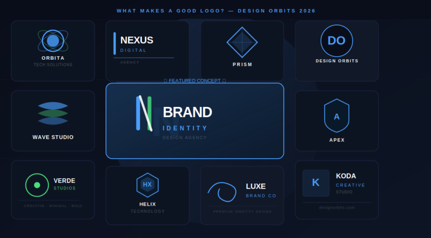
The 7 Principles of a Good Logo Design
These seven principles are not opinions; they are the foundation of every great logo ever created. From the Nike swoosh to the Apple icon, every logo that has stood the test of time follows all seven. Here is what each one means and why it matters for your business.
| Principle 1: Simplicity |
The most effective logos in the world are almost always the simplest. Think of the Nike swoosh — a single curved line. The Apple logo — a fruit with a bite taken out. The McDonald’s golden arches — two curved lines. None of these logos are complicated. All of them are instantly recognisable anywhere in the world.
Simplicity works because simple logos are easier to remember, easier to reproduce at any size, and easier to recognise at a glance. A complex logo with multiple colours, gradients, drop shadows, and intricate details might look impressive in a presentation — but it falls apart when printed small on a pen, embroidered on a shirt, or displayed as a tiny favicon in a browser tab. If your logo cannot be drawn from memory after seeing it once, it is too complex.
| ✓ Design Orbits tip: We always show every logo concept at 16px (favicon size) and 3mm (business card embossed). If it still reads clearly at both, the simplicity is right. |
| Principle 2: Memorability |
A good logo is one that sticks. You see it once and you remember it. Memorability is not the same as simplicity though the two are closely linked. A memorable logo has something unique about it — an unexpected shape, a clever use of negative space, a distinctive colour combination, or a visual idea that makes you look twice.
Memorability is partly about distinctiveness — your logo needs to be different enough from your competitors that it stands apart in a crowded market. A logo that looks similar to every other logo in your industry will blur into the background. The goal is to create something that your target audience sees once and immediately associates with your brand — even without your company name attached.
| ✓ Design Orbits tip: We research the top 10 competitors in every client’s market before designing a single concept. Your logo needs to stand out from that specific crowd, not just look generally different. |
| Principle 3: Versatility |
A good logo works everywhere. It works in colour and in black and white. It works on a white background and on a dark background. It works on a billboard and on a business card. It works as a full horizontal lockup and as a compact icon. If your logo only works in one specific combination of size, colour, and background, it is not a versatile logo.
Versatility is one of the most overlooked qualities of a good logo, and one of the most important in practice. Your logo will be used in contexts you cannot predict today, on merchandise, on a sponsor banner, on a TV appearance, on a dark social media background, on a vehicle wrap. A professionally designed logo comes with a full set of variations, primary lockup, stacked version, icon only, white version, and black version, so it always looks perfect regardless of context.
| ✓ Design Orbits tip: Every logo we deliver at Design Orbits comes with all format variations as standard — AI, EPS, SVG, PNG (white, black, colour), and PDF. You will never be caught without the right version. |
| Principle 4: Timelessness |
A good logo should still look relevant in 10, 20, or 30 years. Trends in logo design come and go. Gradients were everywhere in the early 2000s, then flat design took over, and then outlined styles became fashionable. A logo designed around a trend will look dated the moment that trend passes. A timeless logo is designed around principles, not fashions.
The clearest test of timelessness is to look at logos that have barely changed in decades the BBC, Coca-Cola, Chanel. They do not look old-fashioned because they were never designed to be fashionable in the first place. They were designed to be correct. When briefing a logo designer, the question is not ‘what is trending?’ it is ‘what best represents this brand’s core values and audience?’
| ✓ Design Orbits tip: We deliberately avoid logo trends. Our designers are briefed to design for longevity, not for the current moment. A logo that looks perfect in 2026 and 2036 is worth far more than one that looks hot right now but dated in two years. |
| Principle 5: Appropriateness |
A good logo is appropriate for the business it represents. This means it communicates the right message to the right audience. A children’s toy brand needs a logo that feels fun, friendly, and approachable. A law firm needs a logo that feels authoritative, trustworthy, and professional. A luxury fashion brand needs a logo that feels elegant, minimal, and exclusive. The same logo cannot work for all three.
Appropriateness is determined by three things: the industry you are in, the audience you are targeting, and the values your brand stands for. Before any logo is designed, a professional designer needs to understand all three. This is why a strong design brief is so important it gives the designer the context to make decisions about typeface, colour, shape, and style that are appropriate for your specific market and audience.
| ✓ Design Orbits tip: Our logo brief process covers your industry, your top three competitors, your ideal customer, and five words you want people to feel when they see your brand. This context shapes every design decision we make. |
| Principle 6: Scalability |
A good logo is scalable; it works at any size without losing its impact, detail, or legibility. This is closely related to simplicity, but it is specifically about technical execution. A logo that looks great at A4 size but falls apart when printed at 2cm is not a well-designed logo it is a logo that has not been properly thought through for real-world use.
Scalability requires that logos are designed and delivered in vector format, not as rasterised images like JPEGs or PNGs. A vector file (AI, EPS, or SVG) can be scaled infinitely from a 5mm embossed stamp to a 10-metre billboard — with zero loss of quality. A rasterised logo becomes blurry and pixelated as soon as it is enlarged beyond its original dimensions. If your designer delivered your logo as a JPEG only, you do not have a fully usable logo.
| ✓ Design Orbits tip: All Design Orbits logos are designed in Adobe Illustrator and delivered as vector files (AI, EPS, SVG) as standard — even on our £19 Basic package. You will always have a fully scalable logo. |
| Principle 7: Distinctiveness |
A good logo is unmistakably yours. Distinctiveness means your logo could not be confused with any other brand in your market. It has a unique visual identity whether through an original icon, an unexpected colour choice, a custom typeface, or a combination of elements that no other brand has claimed. Distinctiveness is what makes your logo ownable.
Distinctiveness is particularly important in crowded markets where multiple businesses offer similar services. Your logo is often the first thing that sets you apart from a competitor in a potential customer’s mind. If your logo looks generic, like it could have been made with a free online tool, it signals that your business is generic too. A distinctive logo signals investment, professionalism, and uniqueness before a single word of copy is read.
| ✓ Design Orbits tip: We run a distinctiveness check on every logo before delivery, comparing it against the top 20 competitors in the client’s market to ensure there is no visual confusion or similarity. Your logo will be yours alone. |
What Separates a Good Logo from a Bad One?
Now that you understand the seven principles of a good logo, it helps to see what happens when these principles are ignored. Here are the most common signs of a poorly designed logo and why they matter.
Too many colours
A logo with five or six colours is difficult to reproduce consistently across different materials and backgrounds. Professional logos typically use two or three colours at most. More than that creates complexity without adding value — and makes your logo expensive to print in Pantone colours on physical materials.
Relies on gradients or special effects
Drop shadows, gradients, glows, and 3D effects look impressive on screen but disappear or distort when your logo is printed in one colour, embossed, or engraved. A logo that only works with all its digital effects applied is not a production-ready logo. If your logo cannot be reduced to a single flat colour and still read clearly, it has a fundamental design problem.
Uses a generic font
Logos built on system fonts like Arial, Helvetica, or Times New Roman are rarely distinctive. These fonts are everywhere on emails, on documents, on signage. Using them for a logo makes your brand blend into the background rather than stand out from it. A good logo either uses a custom typeface, a heavily modified commercial font, or a completely custom lettering design.
Too complex to read at small sizes
If your logo has intricate details, thin lines, small text, or complex shapes that are unreadable at 32px or below it will fail in real-world use. Favicons, social media profile pictures, app icons, and small print applications all require a logo that reads clearly at tiny sizes. Test your logo at favicon size before approving any design.
Clip art or stock icons
A logo built around a generic stock icon or clip art image is not a bespoke logo it is a template with your company name attached. These logos lack distinctiveness, can be used by other businesses, and signal to clients that your brand was not worth investing in. A genuine logo design always starts from an original brief and creates something that no other brand owns.
How Much Does a Good Logo Design Cost?
Understanding the principles of a good logo is one thing. Knowing what it costs to have those principles applied professionally is another. Here is an honest breakdown of what different budget levels typically deliver.
| Budget | Typical cost | What you typically get |
| DIY tools | Free–£20 | Template-based, not unique, no vector files, used by thousands of other businesses |
| Fiverr / gig sites | £10–£80 | Often clip art or templates, risky quality, limited revisions, no strategy |
| Freelance designer | £200–£600 | Better quality, more custom, but variable and no backup if issues arise |
| Design Orbits | £19–£59 | 4–unlimited concepts, real designers, all vector formats, unlimited revisions, full ownership |
| Mid agency | £1,000–£3,000 | Thorough process, strong strategy, higher quality — but significant cost |
| Top agency | £5,000+ | Enterprise-level brand strategy, extensive research, multiple senior designers |
For a detailed breakdown of logo design costs in the UK, including what each price range delivers and how to get the best value, read our complete guide: How Much Does a Logo Cost in the UK? (2026).
How to Tell If Your Current Logo Is Good
Not sure whether your existing logo meets the seven principles? Here is a quick self-assessment you can do in five minutes. Answer yes or no to each question.
| Logo self-assessment checklist: |
- Can your logo be drawn from memory after seeing it once? (Memorability)
- Does your logo still look clear and readable when reduced to 16px? (Simplicity + Scalability)
- Does your logo work in black and white with no loss of impact? (Versatility)
- Does your logo avoid gradients, drop shadows, and special effects? (Timelessness)
- Is your logo noticeably different from your top three competitors? (Distinctiveness)
- Does your logo feel right for your industry and target audience? (Appropriateness)
- Do you have your logo as a vector file (AI, EPS, or SVG)? (Scalability)
If you answered no to two or more of these questions, your logo has room for improvement. A logo redesign does not have to be expensive but it does have to be done correctly to deliver long-term value.
Good Logo Design: Industry Examples
To see these principles in action, it helps to look at logos across different industries and understand why they work.
Technology & SaaS
The best tech logos are clean, minimal, and forward-looking. Apple, Google, Slack, and Notion all share the same qualities: simple icons, clean sans-serif typefaces, and confident use of white space. The logos feel modern without chasing a trend, and they work perfectly as app icons on a phone screen (the ultimate small-size test for a tech brand).
Professional services (law, finance, consulting)
Professional service logos lean heavily on appropriateness they need to communicate trust, authority, and stability. This typically means restrained colour palettes (navy, dark green, black, gold), serif or structured sans-serif typefaces, and minimal iconography. Complexity is kept low to project confidence rather than creativity.
Retail & food
Retail and food logos have more room for personality and the best ones use it boldly. Think of the simplicity and warmth of the Innocent Drinks logo, or the bold geometry of the Waitrose branding. These logos are memorable, work well at all sizes, and communicate something specific about the brand’s personality.
Startups & creative businesses
Startup logos often take more visual risks, unusual colour combinations, abstract icons, and custom lettering. This works when the distinctiveness principle is met: the logo is genuinely unique, not just generically unconventional. The risk for startups is chasing trends rather than building something timeless.
Frequently Asked Questions About Good Logo Design
What is the most important quality of a good logo?
If you had to pick just one quality, it would be simplicity. A simple logo is easier to remember, easier to reproduce, easier to scale, and more timeless than a complex one. Every other principle — memorability, versatility, timelessness, and scalability is made easier when the logo is simple. Start there.
Can a cheap logo still be a good logo?
Yes — price does not determine quality, process does. A logo designed by a skilled designer who follows the seven principles can be excellent at any price point. The risk with very cheap logo services is that they rely on templates, stock icons, or unqualified designers who do not apply these principles. At Design Orbits, our logo design service starts from £19 — and every package applies all seven principles, delivers vector files, and is designed by a real human designer, not generated by a tool.
How do I know if my logo needs redesigning?
Your logo probably needs redesigning if it fails the seven-principle self-assessment above, if it looks visibly dated, if it does not reproduce well at small sizes or in black and white, or if it does not accurately represent where your business is today compared to when the logo was first designed. A rebrand does not have to mean starting completely from scratch; sometimes a refinement of the existing logo is all that is needed.
What file formats should a good logo come in?
A professionally delivered logo should include vector files (AI, EPS, SVG) for print and large-scale use, PNG files with transparent backgrounds in full colour, black, and white versions, and PDF versions for document use. If your designer only delivered a JPEG or PNG, you have not received a complete logo package — you need the vector files to use your logo professionally in all contexts.
How long does it take to design a good logo?
A professional logo design process typically takes 5–14 days from brief to final delivery, depending on the complexity of the project and the number of revision rounds. At Design Orbits, our standard turnaround is 5–7 business days for the first concepts. Rush delivery is available. The design process includes initial concepts, client feedback, revision rounds, and final file preparation and delivery.
Conclusion: What Makes a Good Logo
A good logo is simple, memorable, versatile, timeless, appropriate, scalable, and distinctive. These seven principles are not a checklist; they are a framework that the best designers in the world apply instinctively to every project. When all seven are present, a logo does its job quietly and effectively: it represents your brand clearly, professionally, and consistently across every context it ever appears in.
A bad logo does the opposite. It creates confusion, looks cheap, dates quickly, or simply fails to leave any impression at all. And in a world where first impressions are often the only impressions, that is a cost no business can afford.
If your current logo is not meeting all seven principles, or if you are starting a new business and want to get it right from day one, Design Orbits offers professional logo design services starting from £19. Real designers, unlimited revisions, all vector file formats, and 100% ownership on delivery. No templates, no AI generation, no shortcuts.
| Ready to get a logo that meets all 7 principles? View our logo design packages starting from £19 with full vector file delivery and 100% ownership. |


